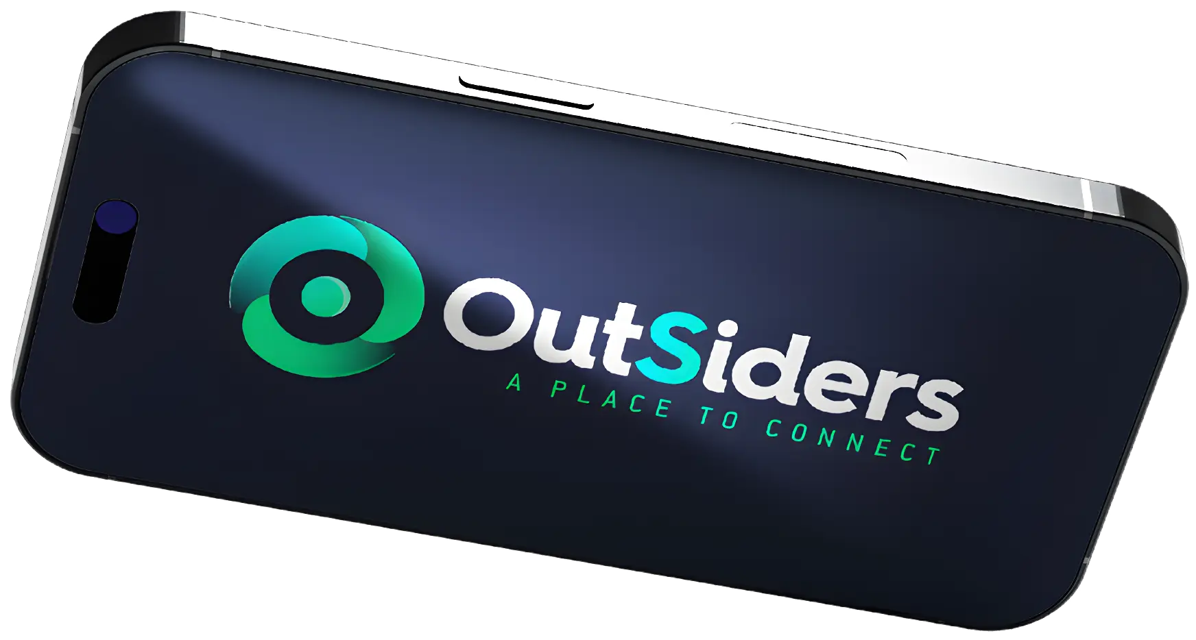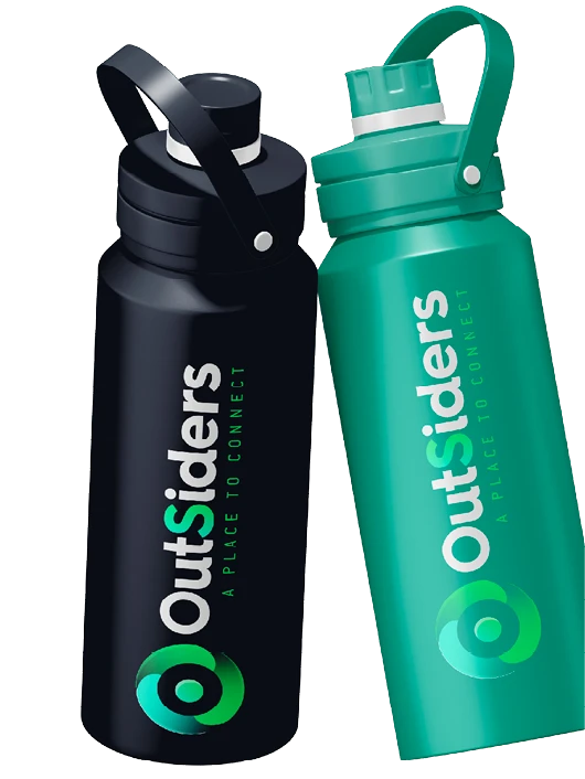


Concept
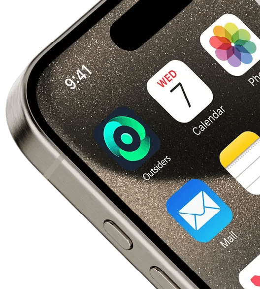
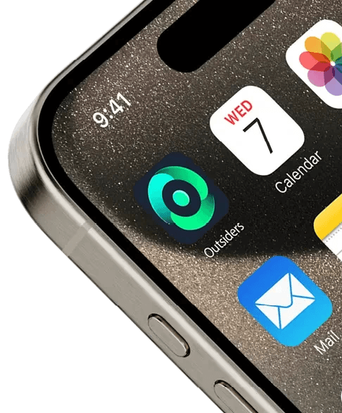
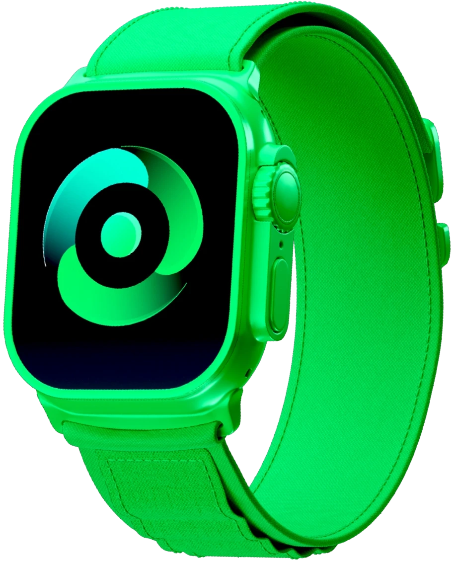
I infused the brand with energy by designing the icon to resemble a spinning wheel, reflecting both cycling, a key hobby of one of the founders, and the motion of movement. The circular shape symbolized a community of like-minded individuals. I paired this with a modern font, a bolder icon, and a trendy color palette to give the brand a dynamic feel and finish.
Although the founders went another way, I still have a soft spot for the icon and color palette I created.